How to make the MUI Component Library your own
For the app side of POW! (my.usepow.app) I choose the MUI Component Library.
I am not ecstatic about the choice, but it gets the job done! And MUI really shines for more utilitarian use cases.
My focus this spring is split between:
- Improving POW! for our users
- Helping you get the most out of Gatsby
So to free up a lot of head-space, we are standardizing on MUI across the board.
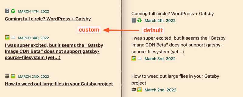
This week queen.raae.codes got the MUI treatment, and as you can see, it does not look very Material UI-y...
A big player in that is disabling "elevation" almost everywhere!
You can do it on a one-off basis:
// On a per use basis
<Button disableElevation />
But that gets annoying fast, and I like to make it a global thing:
// Globally

createTheme({
  components: {
    MuiButton: {
      defaultProps: {
        disableElevation: true,
      },
    },
  },
});
The last approach is also suitable for making more considerable stylistic changes to the default components.
Let's see how I changed the list component for queen.raae.codes:
createTheme({
  MuiListItemText: {
    defaultProps: {
      // Change both the primary and secondary text
      secondaryTypographyProps: {
        variant: "overline",
        gutterBottom: true,
      },
      primaryTypographyProps: {
        variant: "h5",
        gutterBottom: true,
      },
    },
    styleOverrides: {
      // Move the secondary text to the top
      root: {
        display: "flex",
        flexDirection: "column-reverse",
      },
    },
  },
  MuiListItemButton: {
    styleOverrides: {
      // Add underline to emphasis it's a link
      root: {
        ".MuiListItemText-primary": {
          textDecoration: "underline",
          "&:hover": {
            textDecoration: "none",
          },
        },
      },
    },
  },
});
To see all the global changes I made for queen.raae.codes check out the theme folder in its repo on GitHub.
To read more about customizing MUI, check out the How to customize article.
All the best,
Queen Raae
PS: In today's treasure hunt we'll get friendly with theme shadowing 👻 and start customizing the MUI Theme for the new work-in-progress POW! marketing @GatsbyJS site ✨

